Sandvox Designers Guide

Experienced CSS web designers can build their own designs for Sandvox (or tweak existing designs from Karelia.)
If you are only a designer and don't know CSS, you should be reading Sandvox Designers Only for a designer-centric look at Sandvox.
Download the Sandvox Design Kit (includes CSS starting points and sample HTML files for testing).
Please note that all of Karelia's designs are licensed only under the terms of the Sandvox Design License.
If you just want to make a quick change to an existing design, see our page titled Quickly modifying existing designs.
Recent updates to this page:
- Suggestion to use @charset "UTF-8"; at the beginning of supplemental CSS files (IE conditional, print).
Design Overview
Everybody reading this document should be sure to read Sandvox Designers Only for a designer-centric look at Sandvox.
Design Considerations and Constraints
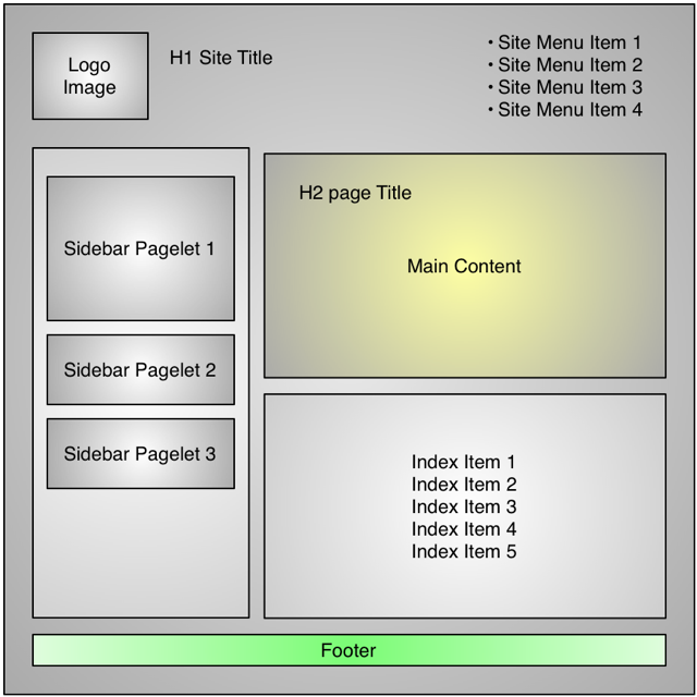
Unlike some web-building programs where designs are simply “skins” on a fixed layout, Sandvox designs are completely abstract, subject to a few sizing constraints. Site/Page titles could go on the top, side or bottom; sidebars can go to the left or right; layouts can even be horizontally scrolling instead of vertically.
Most pages have the same overall structure, but there are several different page types (e.g. text page, photo-viewing page, etc.) that the designer will want to take advantage of.
The HTML markup is very rich, with many opportunities for a designer to hook into special div's throughout the page. Repeated elements have special markup that allows variety in the output.
Many header level text elements can be processed and converted into a graphic that is displayed in place of the text, as well; we call this "Header Textual Images” (described later in this document)
Special effects (such as having items appear to move when you scroll) are OK but should not be intrusive.
JavaScript for special effects and such are OK, as long as the site works perfectly well without JavaScript enabled! It should definitely not be required for navigation.
A page will generally not be empty, except that when the page is first created, it will start out empty. So be sure your design works OK if there is basically no content. If you need to use min-height to force elements to be at least a certain size, that is a good workaround — we want the layout to look OK when it's empty for the authoring environment (which uses Safari's rendering engine). When the real page is published, it hopefully won't need to rely on the min-height property (since that property is not supported in IE 6).
Page Structure Definitions
The body of a page generated by Sandvox may have one or more classes associated with it. See below.
A page can optionally have a logo image set for it. A page should look good with a logo of any size - or no logo at all. You may want to center the logo horizontally and vertically in the space allotted for it; see the thumbnail section for more details.
h1 is the site title.
h2 is the page title.
The sitemenu holds a short list of links to main pages on the website
On most page types (the “allow-sidebar” ones), there is a sidebar which contains objects (a small unit of content), at least 200px wide. Each object has an optional h4 title. Generally, content in a object should be centered (e.g. images) or have reasonable margins (e.g. text).
The main area is the area which holds the main contents.
An article div contains a single block of text & graphics.
Each article can have a callout which is supplemental content for that article. It is made up of objects as well.
For a folder, which we call a collection, its index.html page can be any page type. After the “main” area, it can optionally have an index which lists its contents in a variety of ways. (textual like a weblog, simple listing, photo thumbnails, etc.)
h3 is used for the title of each linked page in an index, which is a list of items listed in a folder.
The following tags have within them a <span class="in">. This is used for header textual replacement.
- h1 or h1 > a
- h2 or h2 > a (h2 > a would happen from an archive page, linking back to the main page)
- h3 or h3 > a
- h3 or h3 > a
Warning: Sandvox uses some element classes such as kBlock and kImage that only appear in the applications' web view, for editing use, and are not part of the exported pages. Do not rely on these classes in your CSS.
Body Classes
- sandvox (always there)
- has-page-title or no-page-title (whether or not there is a page title shown)
- allow-sidebar or no-sidebar (whether or not there is a sidebar on this page; the sidebar could be empty)
- has-custom-banner or no-custom-banner (whether or not a custom banner has been set for this page)
- home-page (if it's the home page, allows for a different look like a taller banner)
- IR or no-IR (whether graphical image replacement has been enabled)
page-top Classes
Options specific to the header area are attached to div#page-top. You can have your design react differently depending on the presence or absence of standard elements.
- has-logo or no-logo
- has-title or no-title (whether or not the website title [not the page title] is showing)
- has-tagline or no-tagline (whether or not a tagline is showing)
Target Browsers
- Modern Browsers (Safari, Firefox, IE7, etc.): Should work really well; take advantage of advanced CSS 2.1/3.0 features if desired with graceful fallback.
- Older browsers like Firefox 2 and Internet Explorer 6 should be planned for, and degrade gracefully if the design has modern features.
- Very old browsers like IE 5.0, 5.2, 5.5, 4.0 don't need to be supported on newly created designs; their usage is minuscule now!
Testing Parameters
Be sure to validate your CSS. CSS should be valid except for aspects where you are pushing the limits of the standards; please use The W3's or WDG's validation service. Mac users may find this script useful: http://earthlingsoft.net/ssp/blog/2007/01/css_validation
If you are doing non-standard but non-breaking things, like CSS 3.0 things that generate an error, that's OK. Some examples of CSS that is not technically valid, but still fine:
- word-wrap: break-word;
- rgba() colours for Safari
- text-shadow
- the various corner-radius properties (like -moz-border-radius and -webkit-border-radius)
See how well the design works with larger and smaller text; imagine the user increasing the browser font sizes...
See how well the design works if you add more content within the body (e.g. a title with multiple lines), or take all the content away.
Look out for any other combinations of large and small bits of content. For instance, what happens if you have a weblog-style collection, with long callout content but short article content ?
Testing Files
It is critical that you test your design's CSS using our testing files in the downloadable designer's kit.
To use the testing files, put the folder "Testing_Files" into the same folder that contains your "main.css" file. (This way, all of the HTML files inside Testing_Files will be able to find the CSS.)
Then, open all of the files inside the Testing_Files folder with your browser. You should see multiple windows, or multiple tabs, with each of those files.
Make sure that each page looks good! Questions you can check include:
- Are there appropriate margins?
- Are things that should be centered actually centered? Use Firebug or a pixel-measuring tool (like xScope on the Mac) to verify.
- For tests of large text, how well does the design cope? Does it expand to fit larger text?
- For pages with an empty item, is the item actually no longer visible, or are you leaving an empty area on the page?
- Are the metrics of each page consistent with the metrics of other pages?
- Are images shown at the correct size, not stretched or truncated? Do the images in objects show a full 200 pixel width?
These files should all be tested on other browsers as well.
Ideally, the design should be installed into Sandvox and taken through its paces, especially to make sure that the editing boxes are reasonable.
Creating Families of Designs
In Sandvox 1.x, many third-party designs were actually part of a family, where a general look and layout would have multiple variations in color and/or width. Before Sandvox 2, installing a design family meant installing a large number of files (one per variation in the family); each of those variations would show up in Sandvox as an individual design.
With Sandvox 2, we introduce the concept of design families. The design chooser can show a family as a collapsed group, or expanded to show each member of the family.
In order to take advantage of this, and not fill up the user's design chooser with ungrouped, individual designs, there are two approaches that the contributing designer can take.
Sandvox-1.x-Compatible Families
We suggest for all design families that are being developed for working with Sandvox 1.x as well as Sandvox 2 use this approach. As before, each variation is packaged as an individual design. However, you add some new keys to the Info.plist for each design in the family, to indicate that they are to be grouped into a family. Sandvox 2 will find these keys and group all of the designs together properly.
See the following keys in the Info.plist reference: parentBundleIdentifier, parentTitle, and isFamilyPrototype.
By specifying these keys properly, your designs will function in Sandvox 1.x as before, but be ready for Sandvox 2.
Sandvox-2-Only Families
With the recognition that it is quite tedious to have to maintain nearly identical variations of designs, we have a new technique for packaging all the family variations you provide into a single design package.
The way that this works is that you indicate all of the generic, shared CSS in the main.css file. Then, you create several CSS files, one for each variation; you can also have a folder of images that are specific for each variation. You will also create a thumbnail image for each variation.
For example, let's say that you have four variations which you will call red, blue, red-wide, and blue-wide. You would create folders in your design package with these names. You would also create CSS files, e.g. red-wide.css, blue.css, etc. — they would reference the images in your folders, e.g. url(red/bullet.gif). The thumbnail files for your variations would be named like red.thumbnail.tiff, blue-wide.thumbnail.tiff, etc.
In the info.plist, you would have an array of dictionaries under the key of variations. Each item in the array corresponds to a variation. In the dictionary for each array, you would specify the file name (e.g. red-wide), optionally a suffix to add to the main title of the design, and any other properties in the Info.plist that you would like to override to be specific to the variation. (For instance, you might specify a wider banner image or viewport width for a wide variation of a design).
Since only Sandvox 1.x does not know about these variations, this kind of specification for a design will only work in Sandvox 2.
Migrating older Families to being Sandvox-2-Only Families
If you are continuing to make Sandvox 1.x-compatible design families, but you would like to change them to be Sandvox-2-only families later, here is a suggestion to consider. Try splitting your CSS into generic code that will be the same regardless of your variation, and put that into the main.css file. At the bottom of that main.css file, import a file "variation.css" which contains the CSS that is relevant only for each variation. For each design in the family, the main.css file will be exactly the same; the variation.css file will be what varies. This will make it easier to re-structure your design as a Sandvox-2-only design family later.
Structure of a Sandvox Design Package
A sandvox design is a packaged in folder. It is named for the design's title (a hopefully catchy name which doesn't appear on the page) with the extension ".svxDesign". (It will be a package in the Finder on OS X if you have Sandvox installed.)
The folder contains the following elements:
- main.css
- CSS file to handle all page types generated by Sandvox. (Optionally, you can include other CSS files from main.css to deal with browser-specific issues.)
- print.css
- optional print-media CSS file. Since this is loaded separately, please start your file with @charset "UTF-8"; (before even any comments) to make sure the file loads properly when the source HTML files are UTF-16 encoded.
- Info.plist
- Computer-readable file describing the technical details about the design. Also a good catch-all place to store information such as the sources of images and fonts. See details below.
- placeholder.jpg
- a picture (optional), 640 pixels wide or tall, that will show up as a placeholder for a photo page. This photo should go well thematically with the design it accompanies. Karelia can often find a good placeholder to go with your design.
- javascript.js (optional)
- Allows you to bundle a script that every page will reference just after jquery. Please ensure your script is UTF-8 encoded, as that is all Sandvox supports right now. Alternatively, if you have more than one script file to import, specify their file names in your info.plist file.
- thumbnail.png or thumbnail.tiff
- A thumbnail image representing your design. Not a miniaturized version of the page, but an image to indicate the essence (color and images, not text) of the design. Sandvox adds a rounded-rectangle border around this image, so do not include any border in your image. For thumbnails showing a pixel pattern from the design, the image can be its minimum size of 100 pixels wide by 65 pixels high. Most thumbnails should be double size (200 by 130) or even quadruple size (400 by 260) for a future version of Sandvox to display at a higher resolution ... but if the thumbnail image has pixel textures equivalent to the web page, it should not be scaled up. You can use a multi-resolution TIFF if you want to make sure the thumbnail looks good in several sizes.
- Credits.rtf
- Credits file containing copyright information, credit for third-party graphics and fonts, etc.
The folder also contains any images (.png, .jpg, .gif) and fonts (for Header Textual Images) used by the design. These can be in the same directory as the rest of the files or in a subdirectory (that your CSS files will reference)
Additional text files (ending in .txt or .rtf) containing notes, licensing information, etc. are fine; they will not be uploaded to web sites that use your design.
You can reference other .css files from your main.css and include them in this folder.
Sandvox-2-Only Design Families
If you have specified design variations (Sandvox 2 only) in your Info.plist, you can also have, for each file listed:
- file.css
- The CSS specific to a variation; it is loaded after main.css.
- a folder with the name of file
- This would hold the images that are specific to each variation. It should be referenced in the file.css as a relative path, e.g. blue/bullet.gif
- file.thumbnail.tiff or file.thumbnail.png
- thumbnail, as above, for a particular variation's thumbnail.
Info.plist format
This XML file can be opened in Property List Editor or a text editor. It contains the following keys and values:
(Note: Some keys in Sandvox 1.x had different capitalization or used a prefix "KT" which will be gone in Sandvox 2. The old values will continue to work, but please use the new standard keys here if you are creating designs specifically for Sandvox 2.)
Design-wide Properties
Vital Statistics
- CFBundleIdentifier
- unique identifier for your design using the reverse domain name, like com.domain.name. Designs provided with Sandvox will be of the form sandvox.title. (Spaces are OK in this identifier) Yours would be like com.myCompany.Sandvox.MyDesignTitle
- title
- Title of design. (memorable rather than purely descriptive)
- copyright
- Copyright statement. Not used in the program, it's just for the file.
- contributor
- author(s) of design; this is shown with the design in the program. Put your company name here.
- url
- home page (or main Sandvox home page) of design’s contributor.
- comments
- Additional information about the design. (Be careful about keeping this text as valid XML so that the file stays readable by Sandvox!) Not used anywhere, just useful for information.
Versions
- CFBundleGetInfoString
- String to show up in the Finder's Get Info window. It could contain a combination of the other version strings and a copyright statement.
- CFBundleShortVersionString
- Numerical/string version of design; this is shown to the user when they do a "Get Info" from the finder.
- CFBundleVersion
- An integer like 1, 21, 87, 30493, etc. (no letters or decimals); this should be incremented each time it is released to help Sandvox notify users of new versions.
- KSMinimumAppVersion
- The minimum version of Sandvox that is required to use this design. Examples: 1.5, 1.6, or 2.0.
Other Design-wide information
- ignoredResources [KTIgnoredResources in Sandvox 1.x]
- Value is an array of names of files that are in the design bundle that are not to be uploaded or exported as part of a design package. (Sandvox does a pretty good job in knowing what to exclude, but this allows you to be more specific.)
Properties that can be specified for the design, or for a Sandvox 2.0 variation
Most of these will be found at the top level of the Info.plist dictionary. However, any of these properties can also be placed in the dictionary for a particular variation, if you are using the Sandvox-2-only feature of specifying families of designs in a single package. Of course only a few of these will be overridden in practice, but it is possible.
Metrics and Options
- viewport
- This is to provide the best experience when viewing a website with a mobile device such as the iPhone. The default value is 771, which is the standard minimum size for standard sandvox designs. If your design has enough padding on the left and right that this can be an even smaller number, please specify that so that the website won't waste valuable screen space on the iphone by showing borders on the left and right sides. Conversely, if you have a wide design, you should specify a larger value here.
- bannerCSSSelector
- See the section below.
- hierMenuType (Sandvox 2 only)
- See Supporting Hierarchical Menus
- calloutBorderable [CalloutBorderable for Sandvox 1.x backward compatibility]
- true or false, whether callout objects can have a border attribute set. Set this to false if your design doesn’t have any differing look between bordered and non-bordered objects in the callout.
- sidebarBorderable [SidebarBorderable for Sandvox 1.x backward compatibility]
- like CalloutBorderable, for the sidebar.
- menusUseNonBreakingSpaces [KTMenusUseNonBreakingSpaces for Sandvox 1.x backward compatibility]
- By default Sandvox converts spaces in Site Menu items to non-breaking spaces. This ensures that long titles are not split over 2 lines. However, in some designs you may wish to keep the standard spaces. If so, include this key in your Info.plist file with a value of NO (false).
- hasLocalFonts
- If your design does image textual replacement, and you have included a non-standard font in the design package (that you have the rights to distribute), setting this to true will cause the font to be loaded by Sandvox. (This is not related to @font-face usage.)
- bannerWidth
- Width of banner. If unspecified it will be 800 pixels. Deprecated. It is more consistent to specify this in the KTScaledImageTypes section below.
- bannerHeight
- Height of banner. If unspecified it will be 200 pixels. Deprecated. It is more consistent to specify this in the KTScaledImageTypes section below.
- SVArticleGraphicsClearCSSValue
- Compatibility tweak to help in migrating designs from Sandvox 1
- imageReplacement
- a dictionary indicating what elements can be replaced, and what Quartz Composer file should be used. See “Header Textual Images” section.
Categorization
(Sandvox 2, ignored by Sandvox 1)
- genre
- General description of the design. Note the continuum of how funky the design is. Choose from one of the following: minimal, basic, glossy, bold, artistic, "specialty"
- width
- How wide the design is, or how it behaves for variable-sized windows. Choose from one of the following: standard, wide, flexible
- color
- How colorful a design is; the overall color of the text background. Choose from one of the following: bright, dark, colorful
Family Grouping (designs compatible with both Sandvox 1.x and Sandvox 2.0)
- parentBundleIdentifier
- If you have a group of designs, with multiple variations (color scheme, width, etc.) please come up with a single identifier that all of the variations share. This way, in a future version of Sandvox, we can recognize that the separate design packages all belong to the same "family" and can be grouped together in a main choice.
- parentTitle
- If you have a group of designs, with multiple variations (see above), please specify the name of the overall family here. For example, if the individual designs have a name variation like "Green" or "Wide" or "Dark" then the family name would be the main part without the variation.
- isFamilyPrototype
- If you have a group of designs, choose one of the designs to be the prototype design, whose thumbnail image will be initially shown before you scrub through the variations. Set the value to YES in the plist.
Variations (for Sandvox-2-ONLY designs)
- variations
- Specify an array of dictionaries. The array is the list of variations, and the dictionary specifies the properties for each variation.
The following keys can be defined in each variation's dictionary:
- file
- the base name of the CSS file and thumbnail file, and the name of the folder holding variation-specific images. e.g. "blue-wide"
- suffix
- the English suffix, shown to the user and appended to the title of the design family. e.g. "Blue, Wide"
- isFamilyPrototype
- Specify this with a value of YES/true for one of the variations if you want that to show up in the design chooser as the default. This will be the one that is shown at the start of the list of variations.
Other properties can be specified in each variation's dictionary, such as categorization or metrics of the design, if the variation's value is different than the rest of the variations in the design family.
Image Scaling
Your design, especially if it is a non-standard-size design, can specify initial sizes for different kinds of images that are embedded into a web page. Sandvox uses these values to determine the appropriate size to scale a larger image to. These are optional - if you don't specify, then the standard dimensions will be used.
In your info.plist, you would specify a key of KTScaledImageTypes
The value is a dictionary, with any of the following keys. (This is not a full list; see KTScaledImageTypes.plist in the application bundle. However, many of the keys defined are not actually in use in Sandvox.)
- bannerImage
- banner. Note that these override the legacy bannerWidth and bannerHeight settings.
- inTextMediumImage
- image size for main body text
- pageHeaderImage
- The "logo" image
- sidebarImage
- image size for object in sidebar
- thumbnailImage
- Size of an image in the photo grid index; requires Sandvox 2.2 or later.
For each of these keys, the value would be another dictionary, with the following keys allowed:
- maxHeight
- The initial and maximum height that an image can be for the given context. (legacy: height).
- maxWidth
- Width, as above. (legacy key: width).
- maxPixels
- maximum width and height. If specified than maxWidth/maxHeight values will be ignored.
- alignment
- the only value currently supported is "top".
- behavior
- the only value currently supported is "cropToSize" (Legacy: "CropToRect"). If unspecified, the image will be scaled down.
Style Sheet Imports (Useful for fonts)
Because Sandvox builds up its main style sheet by combining multiple bits of CSS, and with the rule that an @import statement must go at the top of a CSS file, we allow you to specify URLs or paths to @import by using the Info.plist.
In your design, specify that key of "import" and as the value, an array of strings representing URLs or paths to other CSS files.
For example:
<key>import</key>
<array>
   <string>http://fonts.googleapis.com/css?family=Delius|PT+Sans+Caption</string>
</array>
Note: Sandvox will automatically convert a "http" link to google fonts into an "https" link if the page being built is to be served over HTTPS. This is a special case for Google fonts; we may have some other mechanism in the future to handle HTTP/HTTPS variations.
Internet Explorer Conditional Comments
To load up code specifically to work around IE issues, we no longer recommend using 'hack' techniques that would invoke an @import. The reason this isn't a good idea is that @import statements are supposed to go at the top of a CSS file, but Sandvox concatenates several files together to make a single main.css file in the published design.
So instead, you should specify which files, if any, should be loaded using IE Conditional Comments.
Use the key of IE, and then specify a dictionary of one or more items. The key in the dictionary is the condition (like "lt IE 6", meaning "Less Than Internet Explorer 6") and the string value is the name of your local file (like ie.css").
        <key>IE</key>
        <dict>
                <key>lt IE 6</key>
                <string>ie.css</string>
        </dict>
This will cause the code to load the IE-specific files to be embedded into your pages in the sanctioned manner.
As of Sandvox 2.5, the IE specific files are loaded after the normal CSS. This allows you to override settings in the main CSS.
Suggestion: To make sure your file loads properly when the source HTML file is UTF-16-encoded, put this in the very top of the file (before even any comments):
@charset "UTF-8";
JavaScript (Sandvox version 2.5 and up)
You can specify one or more scripts for the design to include with the scripts directive. It should be an array of file names (or relative paths) to be loaded (after jQuery is loaded).
Banners
A banner is an image (generally shown along the top of the page) that is part of your design but can be replaced by the user using the inspector. Most designs have settable banners. The banner might go behind the title area, or it might insert itself somewhere in the top of the page.
While a few designs may want to always have a banner (providing a default image), it is better to initially have no banner showing, and insert the banner image into the flow if there is a custom banner image specified. (using the CSS selector has-custom-banner to reserve space for it.)
You will want to put in the CSS for your design to show your default banner (which you include with the design) whenever has-custom-banner is set. When not set, you generally should not show any banner at all.
To allow users to customize the banner in your design, you just have to supply the appropriate CSS selector in your Design's Info.plist file. For example:
<key>bannerCSSSelector</key>
<string>#page-top</string>
If the user does then set a custom banner, the above code would cause Sandvox to generate this CSS, thereby overriding the design default:
#page-top
{
    background: url(path-to-custom-banner.jpeg);
}
You can also adjust other features of the design if the user has chosen a custom banner by using the CSS selectors has-custom-banner and no-custom-banner.
Sizing
Clearly, the user may well select a banner image that is of a different size to the space available. Thus, Sandvox also needs to know the dimensions of your banner image. The preferred method is to use Sandvox's support for customizing media sizes.
Header Textual Images
Because browsers may not have very good fonts installed, and as a way to foster creativity, Sandvox can generate lovely textual images out of headline elements. Text is converted to an image by passing it through a Quartz Composer file that is specified in the design; it is then included in the website and replaced for the actual text using revised Phark image replacement. (This CSS is generated by Sandvox; the designer does not need build any of this into the CSS.)
Note: Your CSS will need to use image replacement on a few specific Graphical Navigation elements. Though it's the same image replacement technique, this is distinct from Header Textual Images.
The hooks we support for image replacement are as follows.
| Code | CSS Selector Equivalent | Description |
|---|---|---|
| mc | #sitemenu li.currentPage span | Current page in site menu |
| m | #sitemenu li span | Other page in site menu |
| h1h | .home-page h1 | Site title for the Home Page |
| h1 | h1 | Site title on other pages |
| h2 | h2 | Title of page |
| h3 | .article h3 | Heading of an index’s link to another page |
| h4s | #sidebar h4 | Title of a sidebar object |
| h4c | .callout h4 | Title of a object attached to an callout |
You can specify any and all of the above selectors in your Info.plist file under the key of “image replacement”. (See some existing Info.plist files for an example.) Please note that, unlike with CSS, you must explicitly specify an entry in Info.plist for each type of text that you want replaced; if you specify a replacement for #sitemenu li but not #sitemenu li.currentPage, you will see a Header Textual Image on all links in the site menu except for the current page.
The Quartz Composer files are generally simple files since they are only rendering a still image. The files should be configured to have a published “String” and “Size” inputs and a published “Image” output. "String" is for the string (not rich text or HTML); "Size" is a value from 0.0 to 1.0 (default value:0.5) that is some adjustment on the size which allows the user to tweak the size to better fit or better word-wrap their title text. Generally, the top level of the file is a “Render in Image” patch with specific image dimensions set which correspond to the area reserved on the web page for the image.
You should match the font, size, and color as closely as possible in your CSS for each element that is to be replaced; that will make it optimal if image replacement is turned off or we are in "editing" mode. Also, if you specify the font-size and width and height of the block in pixels, it will be easiest to drop in the image of the right dimensions.
Note: any element that is getting replaced will be marked as class=”replaced” in the HTML. This will allow your style sheet to provide a reasonable fallback font and size for non-replaced text, and then specify the actual font and size to match the replaced font, so that it matches the rendered text more closely.
Element Specification
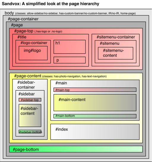
Please download the PDF document showing the hierarchy. (Not embedded in this wiki due to formatting constraints; if we can figure out how to do a table with indentation, it might be worth moving to the wiki.)
RECENT UPDATES
(Not reflected in the PDF or this diagram)
span#logo-container contains img#logo or a.imageLink > img#logo.
div.sitemenu > div.sitemenu-content > ul > > li, with these possible classes:
- i1, i2, i3, etc.
- e or o
- last — we are changing this to "last-item" soon in order to match other iterative CSS. Probably a good idea to handle both selectors.
- currentPage [if this page is the currently chosen page]
- currentParent [if this page is part of the chosen section]
Within the site menu li, you have a > text, or just text
div#page-content has these classes: has-photo-navigation or has-text-navigation or no-navigation depending on what kind of navigation arrows there are.
For navigation arrows, there is a div of class collection-navigation and either photo-navigation or text-navigation. Within that div, there are divs for each navigation element: previous-page, next-page, collection-index. For photo-navigation, there are always all three, and there is an anchor if there is a page to link to. For text, the div for previous or next does not appear if it is not appropriate.
On pages that can have a callout (e.g. text page, you have div.article with a class of has-callout or no-callout (depending on whether there are callouts there). Other kinds of pages (like movie pages) have div.no-callouts around the content. (Apologies for this being confusing -- it's for backward compatibility.) You may want to clear floats in .article-info to properly clear floated images in the article.
Inside div#page-bottom, as of Sandvox 1.6, we now generate div#page-bottom-contents. Inside that, there may be paragraphs or divs, or neither!
Photo Grid
One of the index types built into Sandvox is the photo grid. The aim is to lay out the pages' thumbnails in a neat grid.
HTML
For each item in the grid, the following HTML is generated:
<div class="gridItem">
    <a class="imageLink"><img /></a>
CSS
The photo grid should have fixed-width, left-floated .gridItem divs to allow an arbitrary "photo album" of image thumbnails to display nicely with floating.
In order to make the thumbnail images be nicely centered vertically and horizontally, you may want to employ some CSS similar to the following. It's a bit of a trick, which unfortunately fails in some browser engines. Please use it anyway for the benefit of modern browsers. Note the top: and bottom: declarations.
.gridItem img {
   margin: auto;
   display:block;
   position: absolute;
   top: 0;
   bottom: 45px;
   right: 0;
   left: 0;
}
Navigation Arrows
The user can enable navigation arrows for the entirety of any collection, regardless of content. Furthermore, there are both graphical and textual styles available; which is used is automatically determined by the index in use.
HTML
The HTML Sandvox generates differs slightly between graphical and textual navigation arrows. Of particular note is reversed order of the "next page" and "list" links.
Textual Navigation
<div class="collection-navigation text-navigation">
<div class="previous-page"><a><span>«</span> Page Title</a></div>
<div class="collection-index"><a>List</a></div>
<div class="next-page"><a>Page Title <span>»</span></a></div>
</div>
Sandvox will automatically generate the « & » characters for you; the <span> can be used for styling.
Graphical Navigation
<div class="collection-navigation photo-navigation">
    <div id="previous-photo" class="previous-page"><a>Previous</a></div>
    <div id="next-photo" class="next-page"><a>Next</a></div>
    <div id="photo-index" class="collection-index"><a>List</a></div>
</div>
These should be replaced with Previous, Next, and List graphical buttons. Use revised phark replacement: text-indent: -5000px; background: url(...); height: ...
Important: The div ids "next-photo" etc. are deprecated as of Sandvox 1.5 and remain only for backward compatibility.
Disabled Navigation (Sandvox 2)
When a link to the previous or next page is disabled, the text will no longer be a hyperlink, but will instead be span.disabled-nav.
Continue Reading Link
If the user chooses to truncate summaries then Sandvox will also display a link at the end of the summary that links to the full article. The HTML is generated at the top of the .article-info div as follows:
<div class="continue-reading-link">
    <a>Continue reading…</a>
</div>
It is important to note that the anchor tag is not generated while previewing in Sandvox in order to allow editing. So, please do not rely on it for styling.
CSS
You can use CSS to position the navigation controls pretty much anywhere you like.
Please be careful about vertical spacing for the header, page title, and controls; it would be annoying for somebody to have to scroll down, down, down just to see the page's content. So, it might make sense to put the navigation controls inline next to the title, for example.
Default Styling
To make your life easier, Sandvox provides some sensible default formatting of textual navigation:
div.text-navigation { text-align:center; margin-bottom:1em;}
div.text-navigation div { display:inline; margin:0px 0.5em; }
Navigation-Dependent Layout
There is also a CSS selector higher up the tree to note if a page contains navigation arrows within. This is useful for affecting the layout of other page elements in the presence of navigation. For example, some designs place graphical navigation arrows beside the page title, so this can be used to make the title narrower at the same time. The selector will be one of:
no-navigationhas-text-navigationhas-photo-navigation
Minimal Standards
Most designs will want to take advantage of a number of selectors to make the design fun and beautiful. But a design should do a few things, at the minimum:
- Within a block of text, inline images of class “narrow” and of class “article-thumbnail” should be floated to economize space.
- We have explicit "clear" divs placed after main content items to deal with clearing after floated items. The "Simple Clearing of Floats" technique, where you put overflow:auto in the container that you want floated items to clear, works for the most part, but it may give you problems where it creates scrollbars where you don't want them. So to be safe, we have "clear" to take care of things. There could conceivably be floats on objects, so using overflow:hidden or overflow:auto make sense here.
- To keep font sizes consistent, we are asking that all designs specify, in the body, font-size: 76%; as suggested in "Sane CSS Sizes". This allows us to specify fonts in terms of ems, not pixels or points. <p> text in the main body should be at 1 em. Please avoid absolute font sizes, and make sure not to allow for tiny fonts.
- A few of our indexes (simple listing, photo grids) use
<h3>for what really should display at a normal size and weight. They are marked as<h3>for semantic consistency, but you will probably want to make sure that the display is appropriate. - It would be good to restrict text width to a reasonable width for readability, e.g. max-width: 50em;
- To keep sidebars and the main-content from getting too wide in case of long words, use word-wrap: break-word; (which is not a true standard, but works widely) along with overflow:hidden.
- To deal with PNG files and transparency issues in IE, you may want to make use of some IE-specific fixes for this.
- Please make sure that your design will handle titles (such as in the site menu and objects) that wrap to more than one line. We want to avoid a title truncating or overflowing ungracefully.
- When saving graphic files along with the design, try to choose an optimal format (e.g. PNG over JPEG if the size is reasonable, to avoid compression artifacts, GIF over PNG to get a bit of transparency without being IE-incompatible) and if you are saving from Photoshop, don't include unnecessary metadata. You can make PNGs as small as possible by using PNGCrusher.
- Please avoid using selectors on 'div' and 'span' without class or ID specifiers.
- anchors will have the class "imageLink" when they are surrounding images; this will allow you to have a different look (e.g. no underlines on images)
- Please use CSS Sprites whenever practical, to save on bandwidth.
- Be sure to use good practices when referencing fonts via @font-face.
Sandvox 2
Making Use of Third-Party Content
If you are distributing a design, it is your responsibility to make sure you have clearance for any content you use. This includes images from stock photo sources and fonts you may embed using @font-face or Quartz Composer techniques. Be sure that you have, and have documented, permission to redistribute these properties.
You can document the sources and permissions in the comments section of the "License.rtf" file that goes with a design.
Installation of Designs in Sandvox
Your custom Sandvox designs can be put into any of:
- home folder → Library → Application Support → Sandvox → Designs
- home folder → Library → Application Support → Sandvox
- Library → Application Support → Sandvox → Designs
- Library → Application Support → Sandvox
You will need to re-launch Sandvox to have it notice any changes to your installed designs.
Keywords: designer, designers, guide, guides, guidance, quick, quickly, modify, modifying, modified, change, changing, custom, customize, customizing, customized, theme, themes, design, designs, color, colors, colour, colours, layout
